John Cutler’s “Data-Informed Product Cycle” resonates with me as a depiction of a strong product development process. In the post, he says,
The most successful teams 1. Have a strategy 2. Translate that into models 3. Add minimally viable measurement 4. Identify leverage points 5. Explore options 6. Run experiments
He provides the image below which shows the process as well as the various feedback loops.
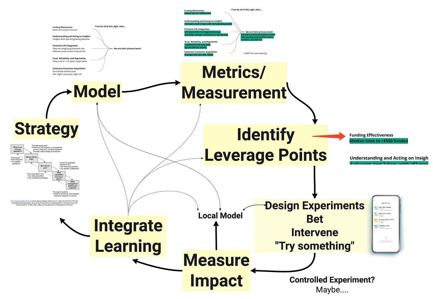
It’s critical that the design, product, and engineering teams are aligned at each step in this cycle. I’ve found that externalizing our thinking in various forms helps build a state of shared understanding amongst the group. This enables better product decision making, and ideally more successful product outcomes.
In User Story Mapping, Jeff Patton talks about the limitations of communicating via documents.
Ironically, we put stuff in writing to communicate more clearly and to avoid risk of misunderstanding. But way too often, the opposite is true. Shared documents aren’t shared understanding. Shared understanding is when we both understand what the other person is imagining and why.
In Making Things Happen, Scott Berkun makes a similar observation. He describes how lists promote linear thinking and become hard to manage at scale. He states that affinity diagrams are more powerful.
They help people see ideas as fluid and tangible things that can be moved around and easily reorganized. This fluidity helps people to question their assumptions, see new perspectives, and follow other people’s thoughts.
Externalizing your thoughts into a visual artifact drives high quality conversations with your team. When we move images on our artifact around, we move ideas around and evolve the shared understanding of the group. Some topics to discuss might include:
- Where are our biggest, riskiest, assumptions?
- Where is the uncertainty?
- What could we do to learn something that would replace risks or assumptions with real information?
I’ve found a few different visual tools to be helpful at various states of the Data-Informed Product Cycle.
Process Flow Diagrams
When I started working on a data labeling pipeline product, I created a process flow diagram to capture all the different steps in the process. As I read design documents, looked at the code, or interviewed users and engineers, I added and refined my process flow.
As the process flow matured, I annotated it with virtual sticky notes that detailed pain points or questions I needed to follow-up on with others. It was a great tool to capture my learnings and to get a baseline on the state of the product.
I used the model in various forms in a variety of situations, such as explaining aspects of our product strategy to the team, onboarding new teammates, and teaching other teams about our domain.

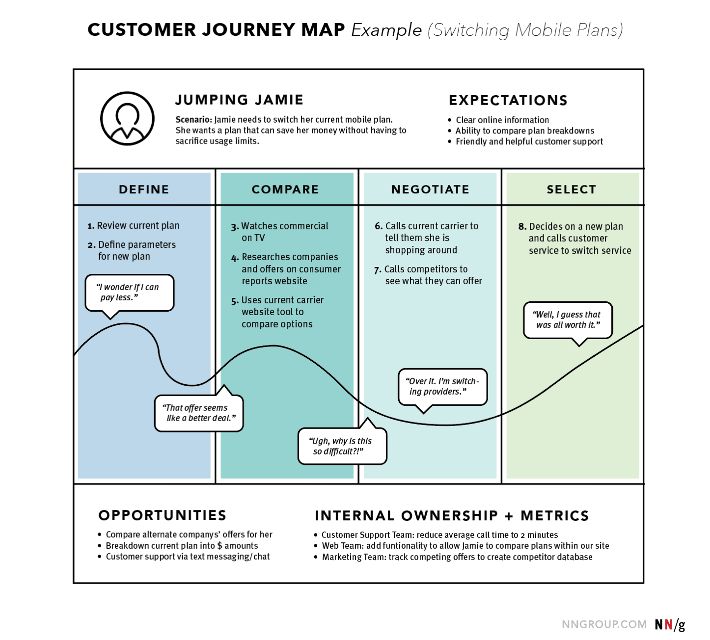
User Journey Maps
A user journey map (https://www.nngroup.com/articles/journey-mapping-101/) is a visualization of the process that a user goes through in order to accomplish a goal. They often focus on a specific scenario and the journey is broken down into different phases. In each phase, the user’s behaviors, thoughts, and feelings are recorded.
I’ve found these to be helpful during initial product discovery. They are helpful to capture key insights from the user research and get the product team aligned on a high level understanding of the user experience.
Opportunity Solution Trees
Teresa Torres developed the idea of Opportunity Solution Trees as a way to visually organize product opportunities identified through various forms of user research.
The tree starts with a desired outcome at the top, and branches out into various opportunities (pain points, needs, or opportunities to delight the user). Under each opportunity are linked the solutions that connect to a targeted opportunity. Under each solution are different experiments to test a solution.
I’ve found these to be helpful for a few reasons. It ensures we’re comprehensive when we are identifying our leverage points and determining where to focus. It can show us where we may need to do additional user research or product discovery if a certain are isn’t as detailed as others. It also helps with prioritization discussions, ensuring that we are only pursuing solutions that are aligned with the outcome we want to achieve.

User Story Maps
User Story Maps describe the tasks users of the product take in order to achieve their goals. Tasks in a map are arranged in a left to right narrative flow and can be broken down into different levels of hierarchy. Top level tasks are called “activities” and they aggregate tasks done by similar people at similar times in order to reach a particular goal. The activities form the backbone of the map, and are broken down into their associated sub-tasks.
User Story Maps are generally used for planning and implementing a feature. User story maps are helpful to break a feature down into smaller pieces so the product development team can plan and sequence their development work.
More specifically, you can group the tasks into rows or “slices.” Slices can depict the tasks required in different releases. They could also define the development strategy, breaking the work down into multiple sprints.
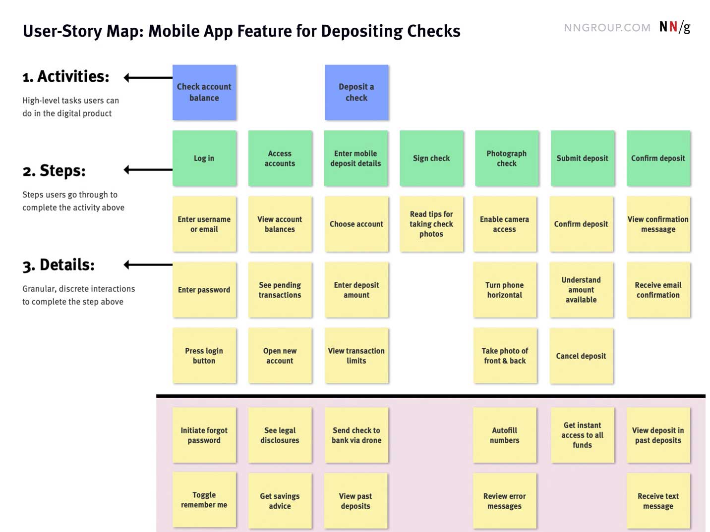
I’ve found these tools useful for organizing and distilling large amounts of information into a format that’s digestible by a product team. They focus conversations, improve collaboration, and serve as an import artifact to document product discovery and development efforts.
As the mathematician Samuel Karlin said,
The purpose of models is not to fit the data but to sharpen the question.